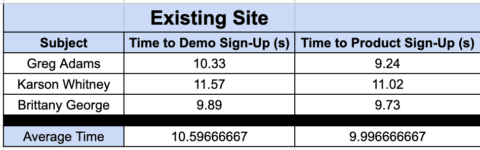
Successfully Reduced Sign-Up Time by 25%
Eliminating productivity roadblocks that steal both precious time from users and hard-earned cash from the company!
Duration
January - June 2023
Tools
Figma, WordPress, Photoshop, Illustrator, Google Sheets
Responsibilities
Research, sketches, wireframing, visual design, user testing
Role
UX Designer
Problem
OrthoSelect, a Digital Orthodontic Laboratory, offers three products. The executives at OrthoSelect noticed that their flagship product, DIBS AI, wasn't standing out on their website. They found clients also needed help finding specific information like pricing and training materials for DIBS AI.
Given DIBS AI's stronger name recognition and higher revenue opportunity, OrthoSelect's leadership decided to prioritize it on the site. They asked me to create a dedicated homepage for DIBS AI linked to the main site, aiming to improve visibility and accessibility for clients.
How might we increase the conversion rate of potential customers signing up for demos of our product and signing up for DIBS AI on our website?
Constraints
Business
6-month timeline
Sole Designer
Technical
1-page
WordPress
User
Can't contact users
Orthodontists
In initial meetings with stakeholders, I focused my discovery on constraints first. As we navigated the strategy and planning behind this product, we identified the following constraints in their respective categories.
Getting Started
As a result of this site audit, I suspected that users were having a hard time signing up for product demos because the site didn't place enough emphasis on the primary product.
Since I wouldn't have access to our main users, I knew it would be important to be thorough during the discovery phase. Gathering sufficient data during this phase would be crucial to the success of this product.
To start, I completed a preliminary Site Audit. I wanted to become a subject matter expert on the site's current offerings, including assets and features. I also spent time researching what strategies similar companies use to present their products.
DIBS AI is overshadowed by other products on current site
Proto Persona
Even after recognizing that key information and links regarding DIBS AI were being buried by the other product information, I wanted to reaffirm that hypothesis. To accomplish this, I mapped out what could be our audience’s journey on the current site.
Dr. Gupp, an experienced orthodontist, seeks innovative technologies like DIBS AI to enhance patient care. Introduced by a colleague, he searches online for clear explanations, workflows, and reviews. His aim: to find a demonstration and potentially sign up if it fits his practice needs.
Dr. Gupp is familiar with computers but has spent most of his career using the same programs. He is very busy, taking a full schedule of appointments every day if he can.

Dr. Waylon Gupp
56 / Male
Occupation:
Orthodontist
Location:
Salt Lake City, Utah
Tech Skills:
Intermediate
Pain Points:
Can't find a product demonstration on the site
Can't find sign-up options on the site
Is looking for an indirect bonding solution that meets his needs
By mapping the process orthodontists use when trying to sign up, a crucial insight emerges. Our users, busy and often older, face challenges with new technology and will exit the site if they get impatient.
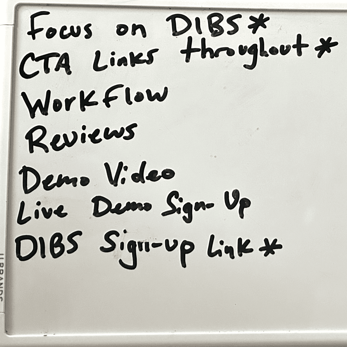
Informing the Design
Spotlight DIBS AI in hero section
Powerful call-to-action action to highlight the capabilities of DIBS AI
Prominent CTA's for key tasks throughout
Simplified workflow description
Current customer reviews
Demo video and Demo Sign-Up featured
Now that I had a better grasp of the challenges our users were facing with the current site, I wanted to organize the features on the current site based on how effective they are at helping the user accomplish key tasks.
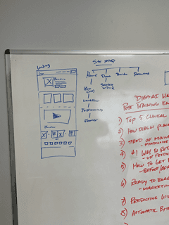
To use every resource available to me, I enlisted the help of the only other employees at OrthoSelect with any level of design experience. Together, the three of us completed a whiteboarding session where we took the site map from my discovery work and laid out the features in order of most helpful and least helpful for completing key tasks.


Redesigning the Site and Updating Features
Armed with the list of most effective features on the current site, I used some of the existing information from the most effective features and updated the designs. I then started playing with the placement of the features around the page. From the feedback I got from the first wireframes, I was able to iron out some of the layout questions that had formed.
Wireframe 1
Wireframe 2
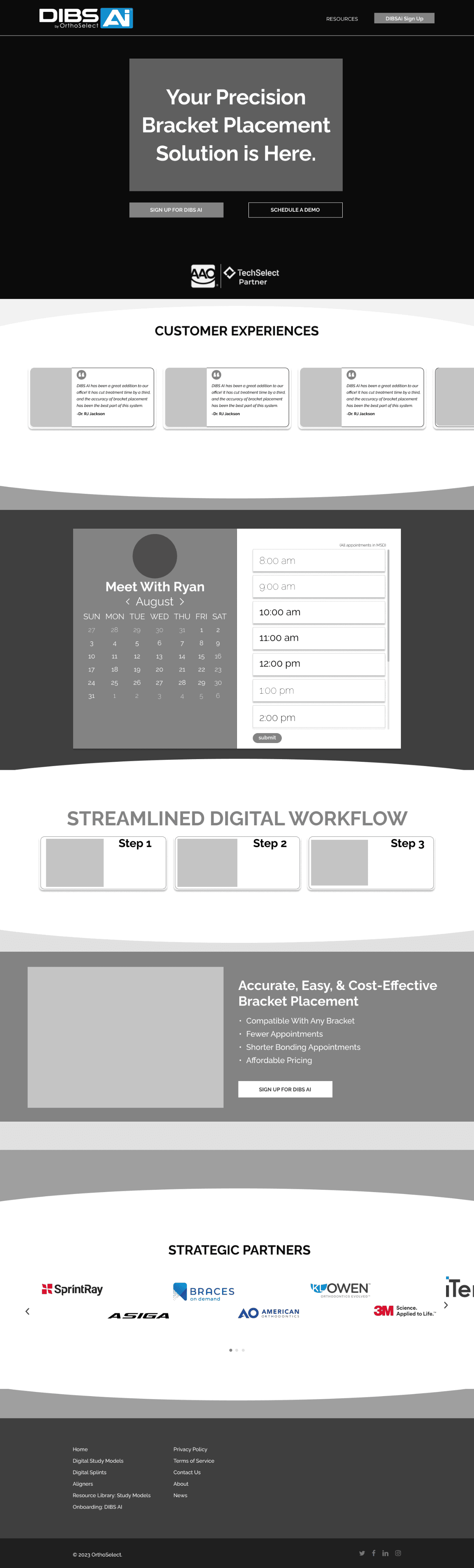
In the initial designs, I focused specifically on making it as easy as possible to accomplish key tasks. I wanted to make it possible for a user to succeed in signing up for a demo or the product without even scrolling.
Redesigning the Site and Updating Features
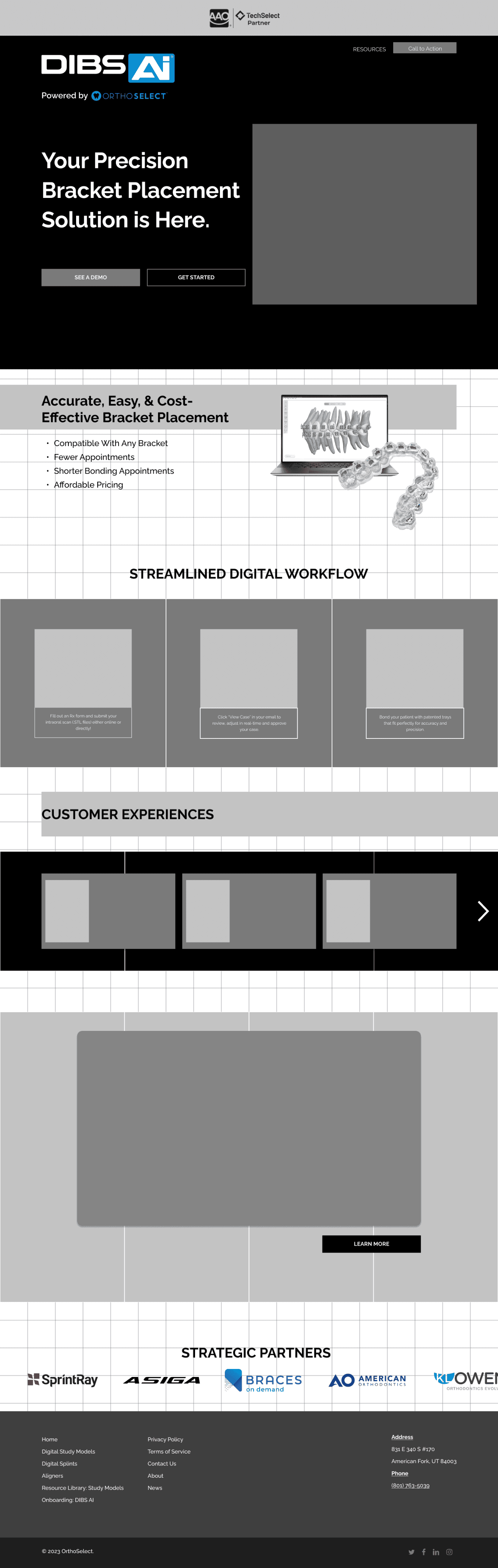
After completing the wireframes and getting feedback from the the stakeholder, I was able to take the features they wanted and implement them into high-fidelity surface comps.
Surface Comp 1

Surface Comp 2

Final Testing
After presenting these designs, the stakeholder chose Surface Comp 1- the design with the video out of the two. Using Surface Comp 1, I tested the usability of the site by timing different subjects in accomplishing key tasks and compared the results with the times of completing the same tasks on the original site.